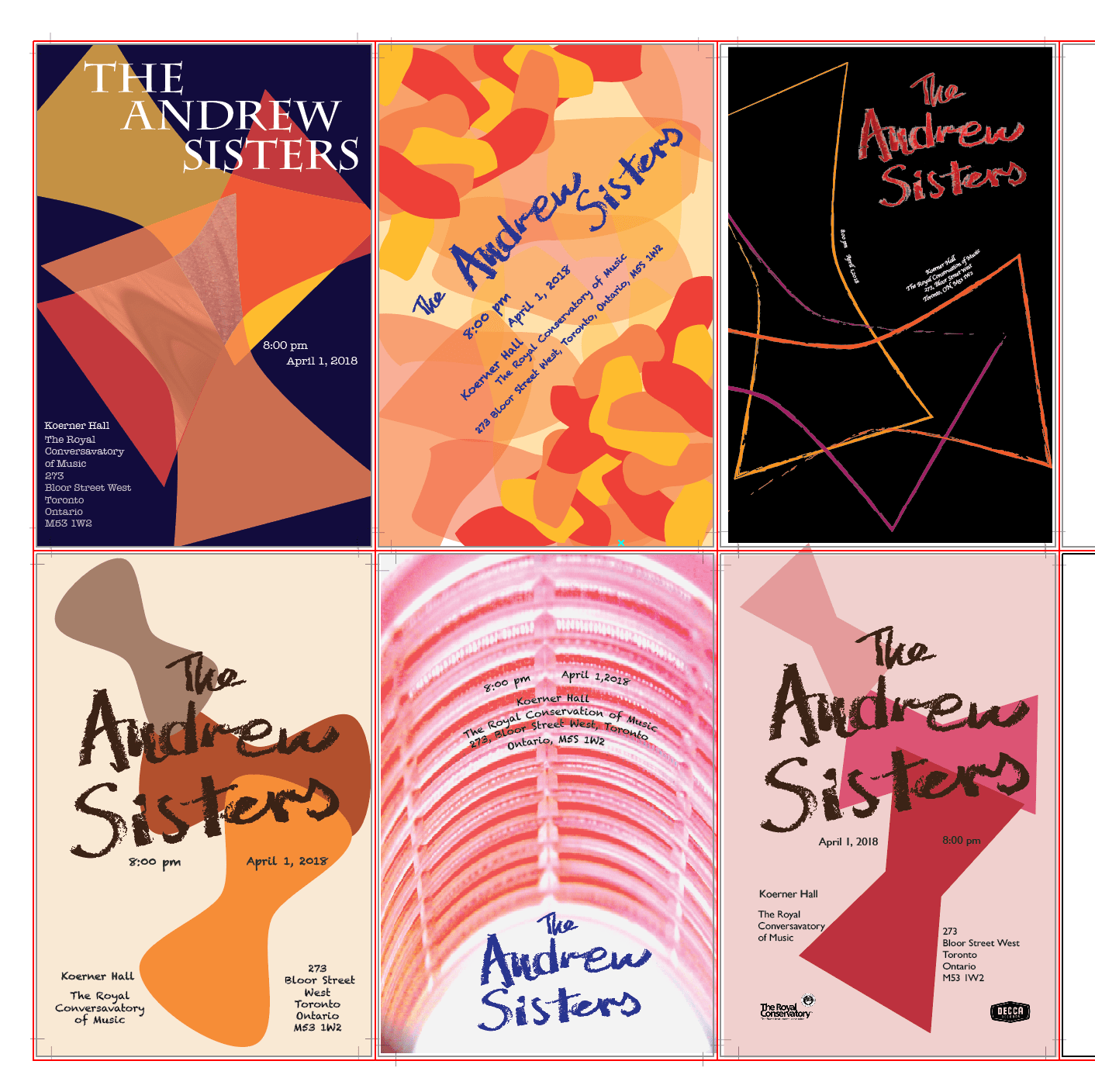
Historical Music Poster

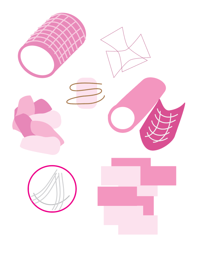
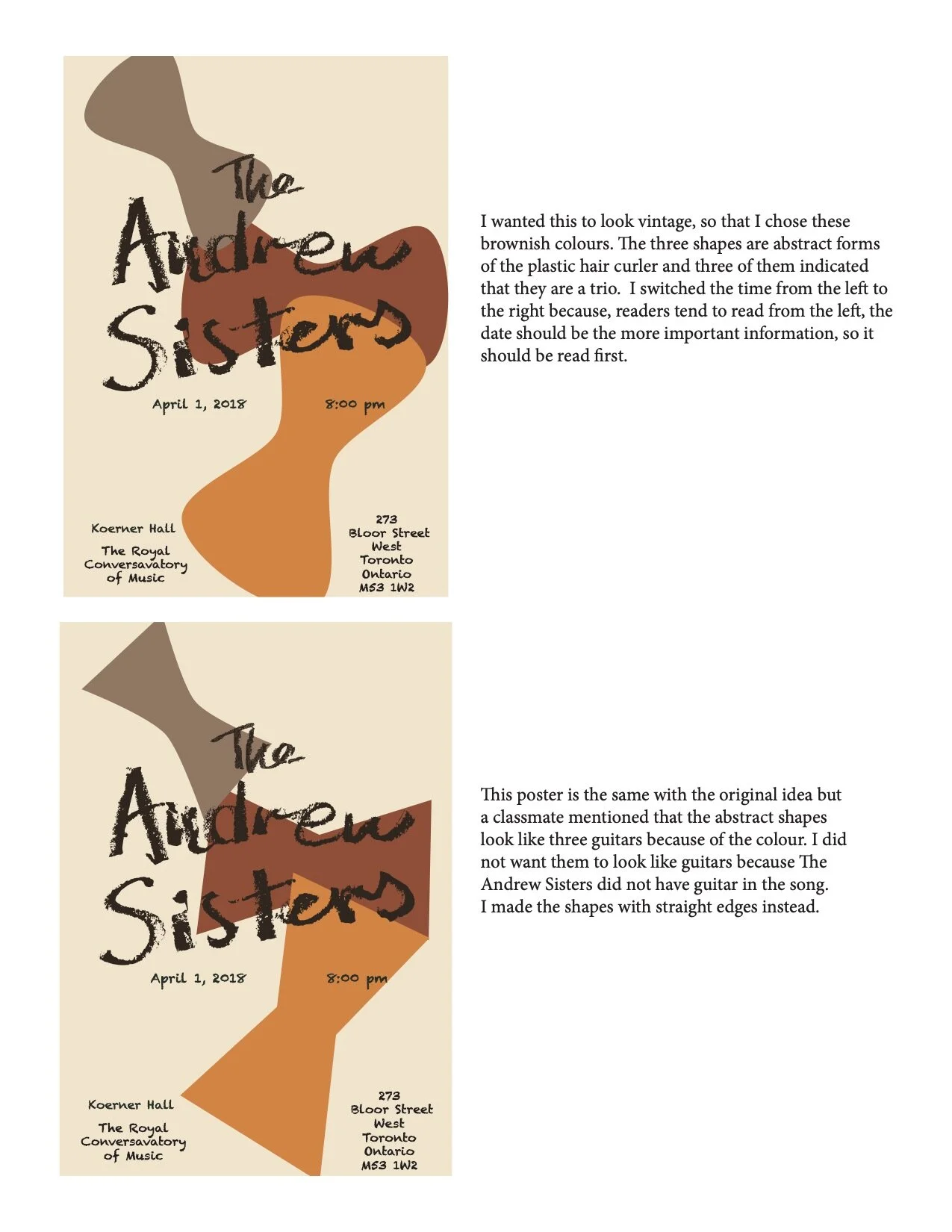
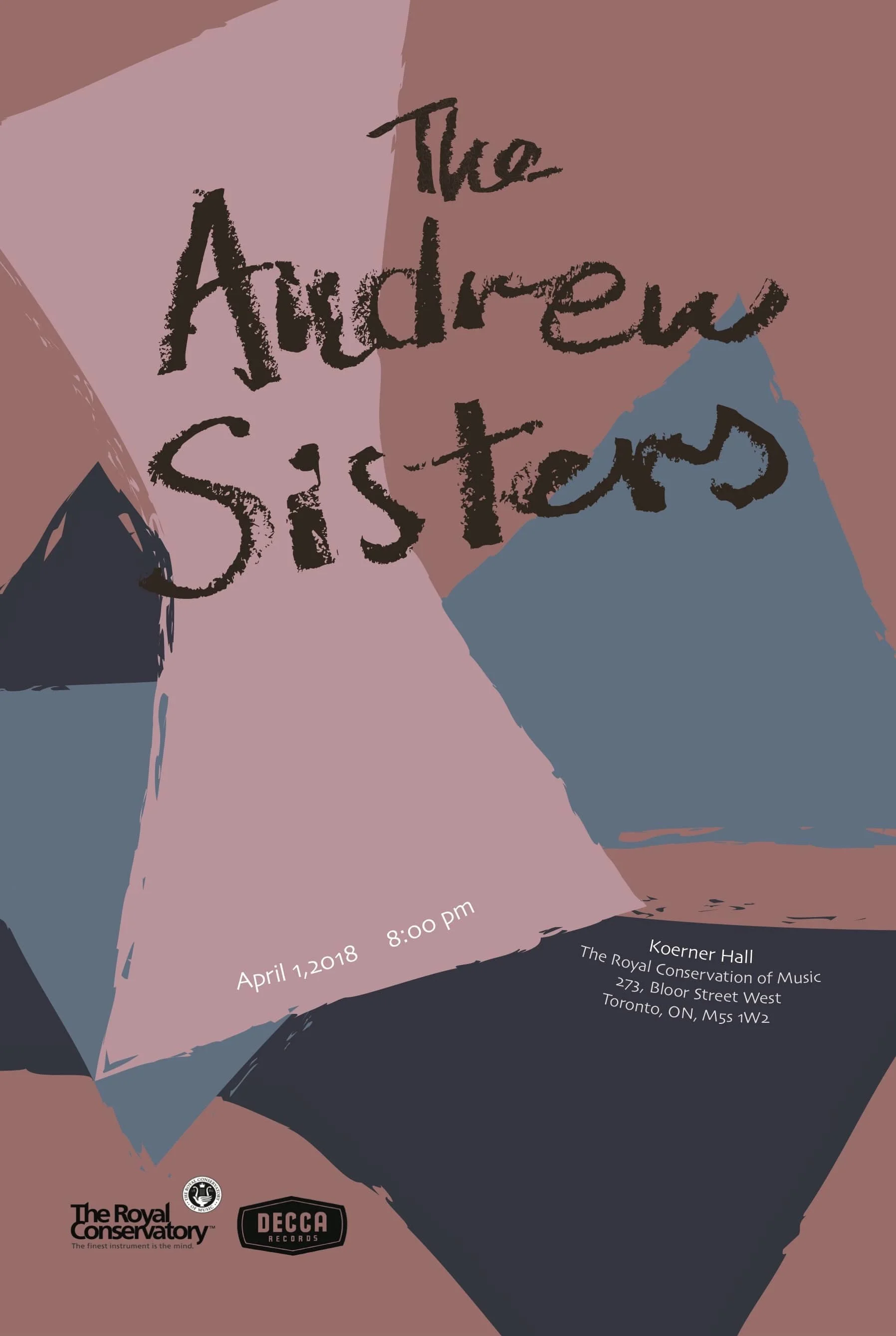
Throughout the poster making process I created a few iterations, and found that the lighter colours works better with the song. I was also given the suggestion to change the colours to pinks and blues to create contrast, therefore I tried and made colour variations with two of my original designs using the abstracted shapes from before. At last, I went with the poster where the shapes are overlapping, representing the layering in their voices and that they are a group with three people. I chose these colours as they are not super saturated to create the vintage feeling, but also having the contrast to bring out the lively mood of the song. The rough edges of the shapes matches with the custom lipstick font.
ポスター制作の過程でいくつかの試作を重ねた結果、より淡い色合いが楽曲の雰囲気に合うことが分かりました。
また、コントラストを出すためにピンクとブルーに色を変更する提案を受け、以前のデザインで使用した抽象的な形を活かしつつ、色のバリエーションを試作しました。
最終的には、形が重なり合うデザインを選びました。これは、歌声の重なりや、3人組であることを表現しています。
色は、強く飽和させずヴィンテージ感を出しつつ、楽曲の生き生きとした雰囲気を引き立てるためにコントラストを意識して選びました。
形の粗いエッジは、カスタムのリップスティック風フォントとも調和しています。
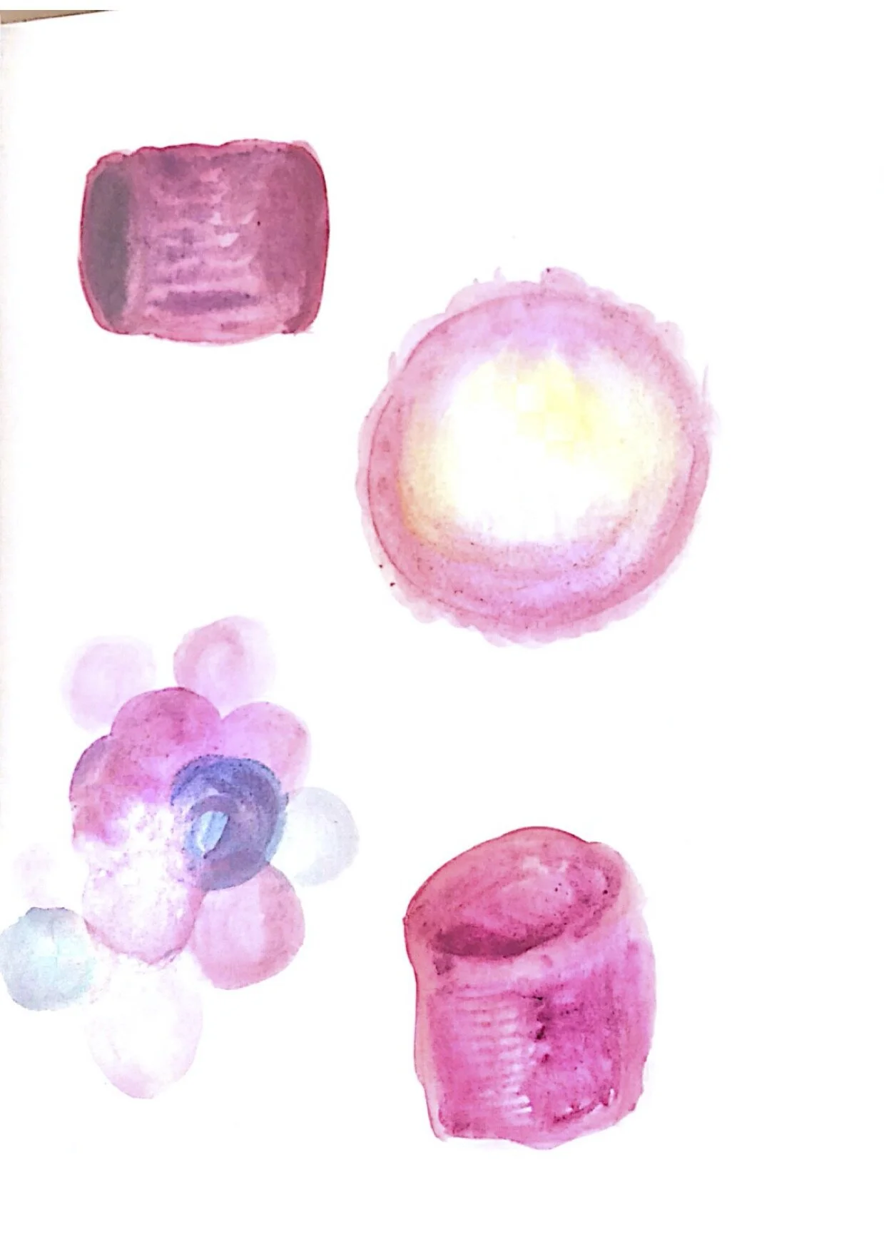
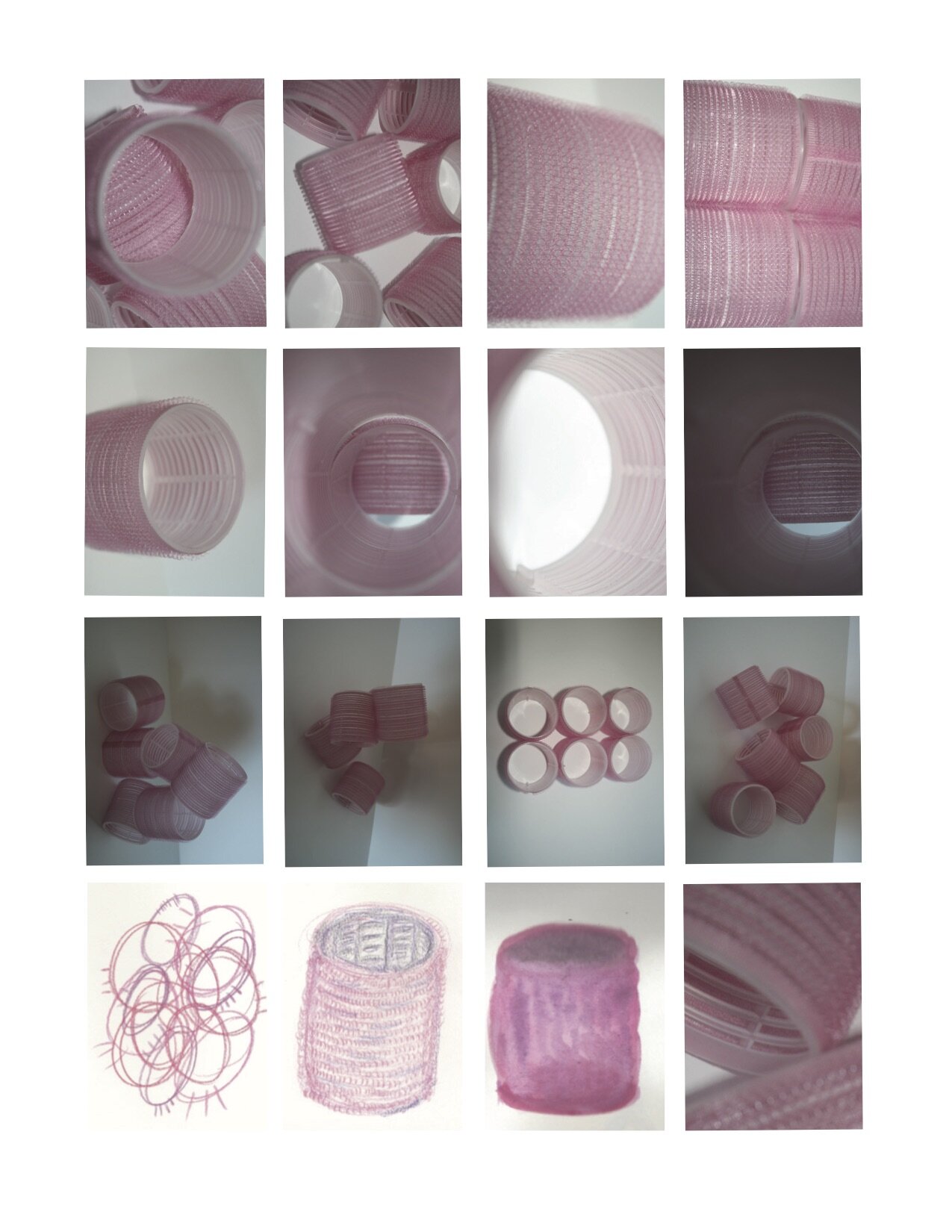
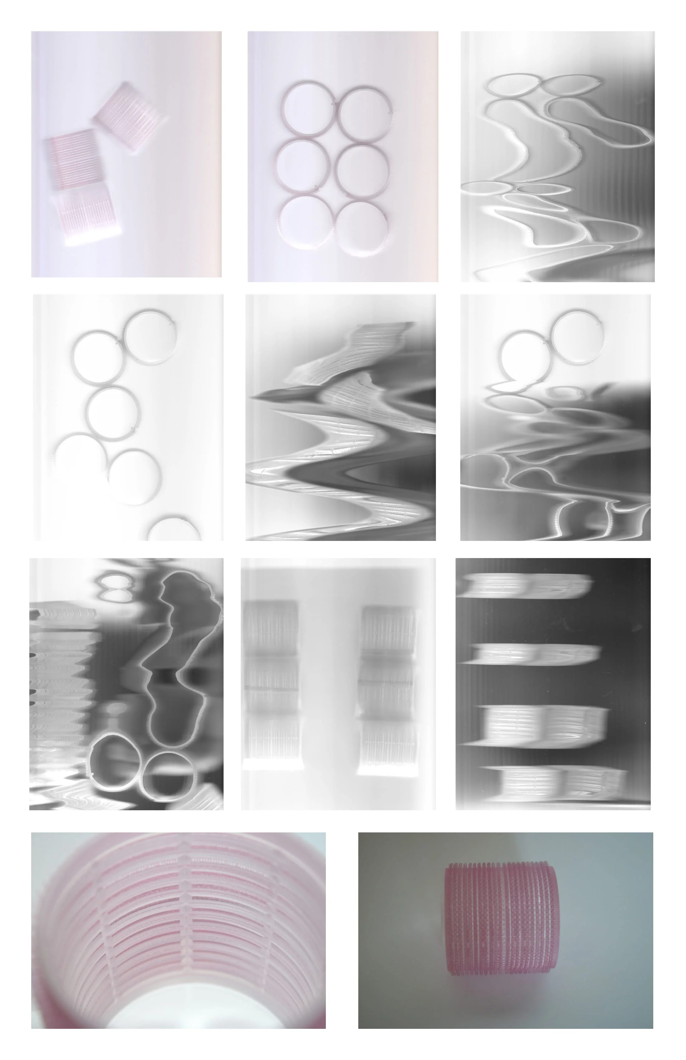
This poster is created for the twenties band—”The Andrew Sisters” with inspiration of the song “Boogie Woogie Bugle Boy”. To complete this poster I chose an object that would represent the group and began with exploring the shape and form of it. The object I chose was a classic pink hair curler, the reason behind that was the performer, The Andrew Sisters are a very significant group during the boogie-woogie and swing era, they have big hair and they often dressed in air stewardess uniforms, their signature looks often involved a lot of hairspray and big hair looks. The song “Boogie Woogie Bugle Boy” has a cheerful and happy mood, I think it goes with high contrast and saturated bright colours. Their entire look was lively and bold. I took the hair curler and tired photographing it to capture the bold colour and the unique textures on it, then took it even further by redrawing it digitally and also with other materials. The colour of the curler is in bright pink and the texture of it represents the texture of the song as they sang in layers as a trio group. I landed on the idea of abstract forms, with a textured outline to represent the texture on the rollers. To symbolize the trio, I used three abstract shapes and the colours of blue and pink, which reminded me of them after listening to their songs.
I personally liked the abstract forms of the curlers the best and that is what I chose to work with. To further explore the song and the artist, I chose to use lipstick to create the title, as I think that lipstick is a bold yet girly item that is also very iconic to The Andrew Sisters, it would give the name a feminine touch, and also gives the words more character and texture. To create contrast, the information listed uses a lighter colour and more structured typeface.
このポスターは、1920年代のバンド「The Andrew Sisters」をテーマに、楽曲「Boogie Woogie Bugle Boy」から着想を得て制作しました。
ポスター制作にあたり、まずグループを象徴するアイテムを選び、その形状やフォルムを探求しました。選んだのはクラシックなピンクのヘアカーラーです。理由は、The Andrew Sistersがブギウギやスウィング時代において非常に象徴的な存在であり、髪型はボリュームがあり、エアステュワーデス風の衣装をよく着用していたことから、髪型やスタイリングを象徴するアイテムとしてヘアカーラーが最適だと考えたためです。
「Boogie Woogie Bugle Boy」は明るく陽気な楽曲なので、高コントラストで鮮やかな色を用いるのが合うと判断しました。グループの全体的なルックも、活発で大胆な印象があります。
ヘアカーラーを撮影して鮮やかな色や独特の質感を捉え、さらにデジタルで描き直したり、他の素材でも表現を試みました。カーラーの明るいピンクは楽曲の多層的な歌声の質感を表現し、抽象的な形状とテクスチャー付きの輪郭で表現しました。3人組であることを象徴するため、3つの抽象形を使用し、青とピンクの色彩で、曲を聴いたときの印象を反映させました。
個人的には、ヘアカーラーの抽象形が最も魅力的だと感じ、最終的にそれを用いることにしました。
楽曲やアーティストの特徴をさらに表現するために、タイトルにはリップスティックを使用しました。リップスティックは大胆でありながら女性らしいアイテムで、The Andrew Sistersの象徴的な要素とも重なり、文字にフェミニンな印象と質感を与えます。
情報部分には、コントラストをつけるために淡い色とより構造的な書体を使用しました。