risograph B
The Risograph process has always fascinated me — from its bold, neon inks to the subtle misalignments and layered color effects. When I finally had the chance to work with it, I was excited to bring these unique qualities into my own design.
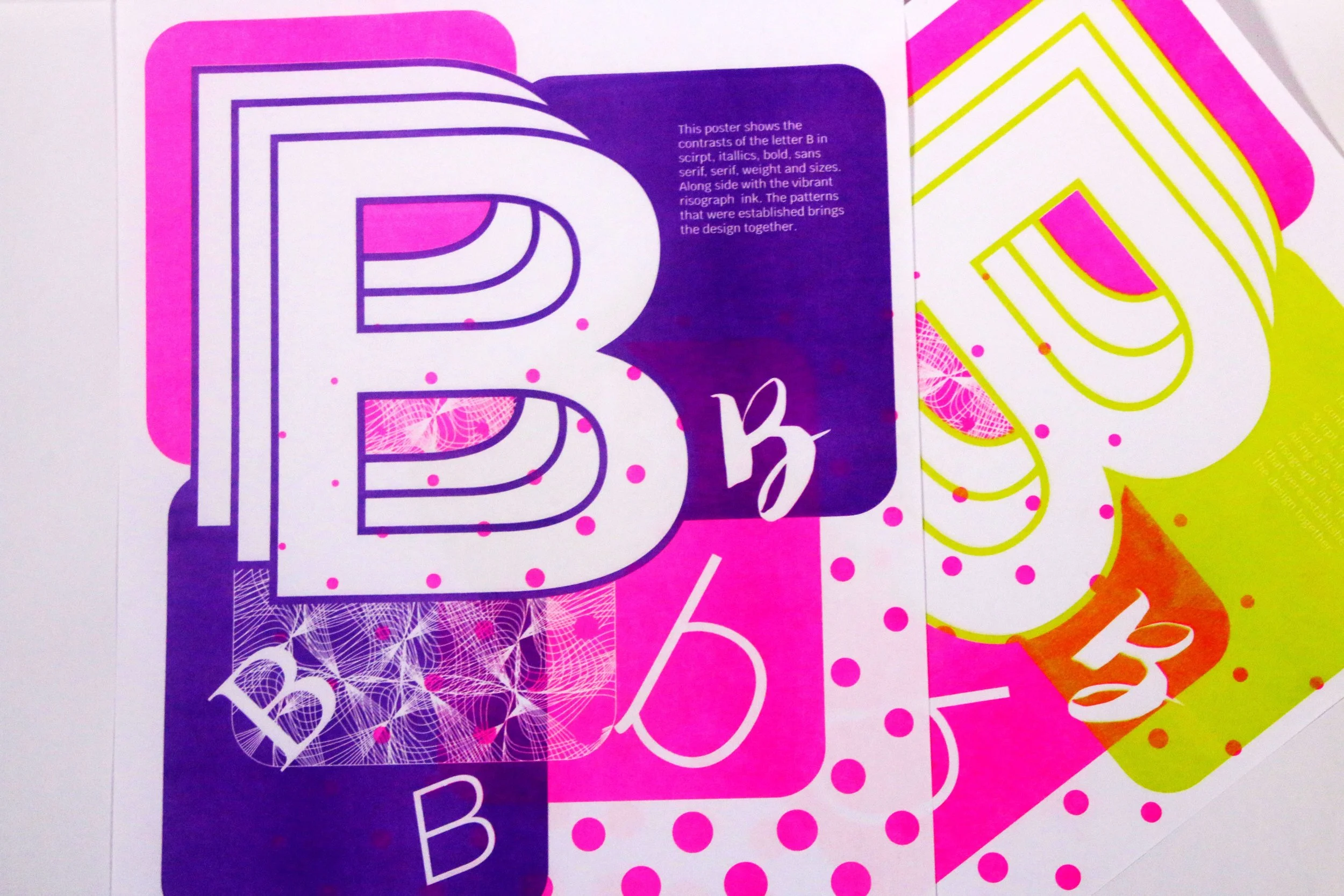
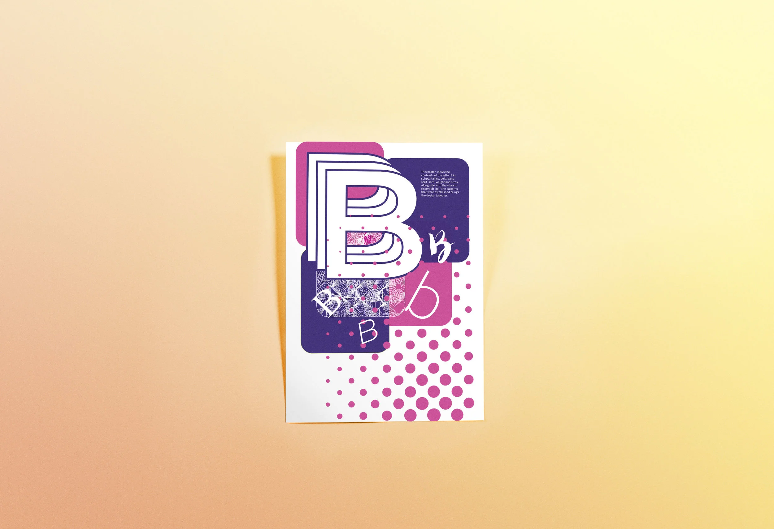
This poster explores contrasts within the letter B, using variations in stance, form, size, and weight. I found that color blocks and halftone patterns were especially well-suited to Risograph printing, and chose to integrate them into the composition.
While the overall printing went smoothly, some of the thinner lines in the pattern didn’t align perfectly due to their delicacy. My original plan was to print in blue and pink, but the blue ink drum was unavailable. I first tried lime green and pink, but the type lacked clarity on the green background. I then tested purple and pink, which produced a darker base and allowed the white text to stand out more effectively. Although the outcome differed slightly from the initial vision, the final result maintained the layered, experimental spirit of the Risograph process.
リソグラフのプロセスには以前から強く魅力を感じていました。
鮮やかなネオンインク、微妙なずれ、重ね刷りによる色のレイヤー効果など、その独特の表現力を自分のデザインに取り入れられることにワクワクしました。
本ポスターでは、アルファベット「B」の中の対比を、姿勢・形・サイズ・ウェイトのバリエーションを用いて探求しています。
特に、色ブロックやハーフトーンのパターンはリソグラフ印刷と相性が良く、これらを構図に組み込みました。
全体的な印刷は順調でしたが、パターンの細い線は繊細すぎて完全には整列しませんでした。
当初は青とピンクで印刷する予定でしたが、青のインクドラムが使用できませんでした。
まずライムグリーンとピンクで試しましたが、背景が明るすぎて文字が読みづらくなりました。
次に紫とピンクでテストしたところ、暗めの背景となり、白い文字がより際立つ結果となりました。
最初のイメージとは多少異なるものの、最終的な仕上がりはリソグラフならではの重層的で実験的な精神をしっかりと表現できています。